

There is a specific discomfort built into Lib Mason’s paintings, and it doesn’t come from the subject matter alone. It comes from the gap between how her paintings look and what they are actually depicting a gap she constructs deliberately, using a centuries-old painting technique to house distinctly contemporary anxieties.
An Inherited Method, Redirected
Mason works in the Flemish technique, a method rooted in Old World painting traditions. Each canvas or panel begins as a grisaille, a monochrome underpainting used to resolve form, value, and the movement of light before color enters the picture at all. From there, she builds the image through successive transparent glazes, allowing color and luminosity to accumulate slowly rather than arrive all at once. The result is a surface that behaves the way light behaves in Renaissance and Flemish painting: layered, glowing, unhurried.
It’s worth noting that Mason did not train in this technique from the outset of her career. She studied editorial illustration at the Rhode Island School of Design and spent years working commercially, producing images for major publications including Rolling Stone and Time Life Warner before moving into product development and artist-branded licensed lines. Her adoption of a historical oil-painting method, taken up roughly eight years ago after she stepped away from commercial work, represents a deliberate technical departure one that trades the speed of illustration for the deliberateness of an older craft.
The Function of Contrast
What makes this technical choice critically interesting is what Mason does with it. She does not use the Flemish method to paint historical or decorative subjects. She uses it to paint political shootings, border walls, and climate anxiety material that could easily be rendered as blunt, illustrative protest imagery. Instead, she routes it through beauty, symbolism, humor, and absurdity, creating pictures designed to invite the eye before they reveal their content to the mind.
This is not simply a stylistic flourish. The contrast between gorgeous surface and disturbing subject does real work: it delays recognition, and that delay is where the painting’s argument lives. A viewer who is charmed by color and flowers before realizing what they’re looking at experiences something closer to complicity than to detached observation an uncomfortable, productive position for a painting to put someone in.
Reading the Contrast in Practice
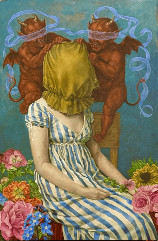
RIP ICE demonstrates this most starkly. Painted in response to the shooting of Renee Good, the composition shows two grinning, blindfolded devils pulling a hood over a seated woman, the entire scene rendered in brilliant color and surrounded by flowers. The woman’s skin is deliberately chalky, pale, and uneven, a formal choice that strips her of specific racial identity so that she becomes universal rather than particular. The devils’ blindfolds are the painting’s sharpest device: figures of menace who cannot see the person they’re harming, a visual argument about power exercised without discernment. Beauty and violence occupy the same surface without resolving into either one.
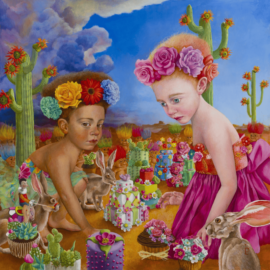
Esparza, Nadine and the Beautiful Wall works through absurdity rather than menace. Responding to the wall built between Mexico and the United States, a structure Mason regards as both troubling and absurd, not least for its disruption of animal migration, the painting replaces the real wall with an invented one: two girls building a wall out of cakes to keep out trolls, watched over by a small figure of Pinocchio. The substitution of cake for concrete, and trolls for people, doesn’t soften the political charge so much as redirect it through the logic of childhood, where the distinction between defense and cruelty hasn’t yet been corrupted. Pinocchio’s presence adds a second layer: a reminder that truth-telling itself has become contested terrain.
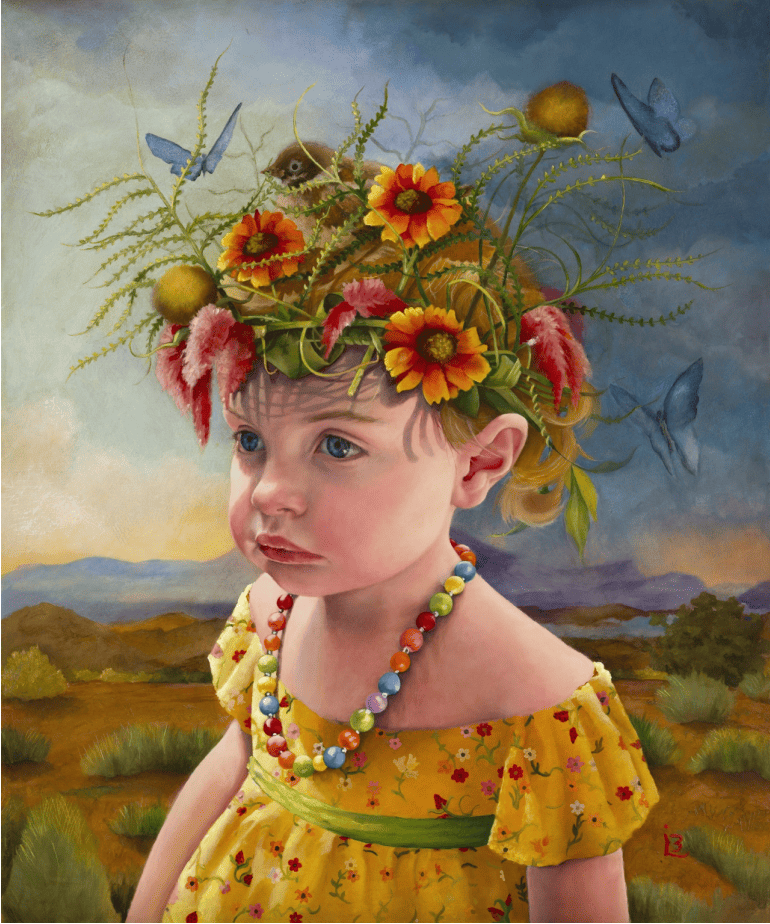
Flight operates with more restraint. A young girl stands alone in a barren landscape no devils, no cake walls, no overt symbolism beyond the bareness of the terrain itself. The painting’s power comes from withholding: it doesn’t tell the viewer what specifically has gone wrong with the environment, only that a child has been left to face its consequences alone.
The Critical Stakes
Taken together, these three paintings suggest a consistent critical position: that beauty is not a distraction from difficult subject matter, but a tool for approaching it. Mason’s technique doesn’t soften her subjects so much as slow down a viewer’s arrival at them, using historical painting language to hold contemporary discomfort at a manageable distance close enough to register, far enough not to look away.
See full portfolio details at libmasonartist.com
and follow @libmason5687 on Instagram.